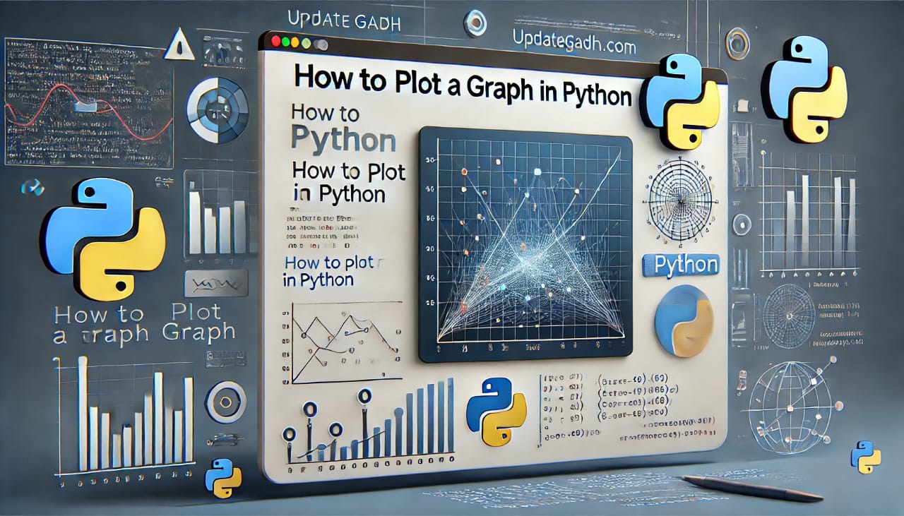
How to Plot a Graph in Python
Python provides one of the most popular plotting libraries called Matplotlib. It is an open-source, cross-platform library for creating 2D plots from data stored in arrays. It is widely used for data visualization, allowing us to represent data using various types of graphs.
Matplotlib was originally conceived by John D. Hunter in 2003. The library has been continuously updated, making it a reliable tool for plotting graphs in Python.
Complete Python Course with Advance topics:-
Installation of Matplotlib
Before using Matplotlib, we need to install it in our Python environment. Open your terminal or prompt and enter the following instrucciones:
pip install matplotlib
This command will install the Matplotlib library along with its dependency packages.
Basic Concept of Matplotlib
A graph consists of several components. Let’s understand these parts:
- Figure: The overall window that holds one or more plots.
- Axes: The area where data is plotted; a figure can contain multiple axes.
- Axis: The scale used to determine the limits of the graph.
- Artist: All visual elements on the graph, such as text, lines, and markers.
Introduction to Pyplot
Matplotlib provides a subpackage called pyplot, which is designed for quick and easy plotting. The matplotlib.pyplot module contains various functions to create and customize graphs. It allows us to:
- Create figures and plotting areas
- Add labels and titles
- Plot data points and lines
Basic Example of Plotting a Graph
Heres how you can create a simple line graph using Matplotlib:
from matplotlib import pyplot as plt
# Plotting data
plt.plot([1,2,3],[4,5,1])
# Display the graph
plt.show()
Output:
Plotting Different Types of Graphs
1. Line Graph
A line graph es práctico para mostrar tendencias a lo largo del tiempo.
from matplotlib import pyplot as plt
x = [1,2,3]
y = [10,11,12]
plt.plot(x, y)
plt.title("Line Graph")
plt.xlabel("X axis")
plt.ylabel("Y axis")
plt.show()
2. Bar Graph
from matplotlib import pyplot as plt
Names = ['Arun', 'James', 'Ricky', 'Patrick']
Marks = [51, 87, 45, 67]
plt.bar(Names, Marks, color='blue')
plt.title('Student Results')
plt.xlabel('Names')
plt.ylabel('Marks')
plt.show()
3. Pie Chart
A pie chart is used to display percentage-based data distribution.
from matplotlib import pyplot as plt
Players = ['Smith', 'Finch', 'Warner', 'Lumberchane']
Runs = [42, 32, 18, 24]
explode = (0.1, 0, 0, 0)  # Emphasizing the first slice
fig, ax = plt.subplots()
ax.pie(Runs, explode=explode, labels=Players, autopct='%1.1f%%', shadow=True, startangle=90)
ax.axis('equal')  # Ensuring the pie chart is circular
plt.show()
4. Histogram
A histogram is empleado para mostrar la distribución de los datos.
from matplotlib import pyplot as plt
scores = [97,54,45,10,20,10,30,97,50,71,40,49,40,74,95,80,65,82,70,65,55,70,75,60,52,44,43,42,45]
range_bins = [0,10,20,30,40,50,60,70,80,90,100]
plt.hist(scores, range_bins, histtype='bar', rwidth=0.8)
plt.xlabel('Score Percentage')
plt.ylabel('Number of Students')
plt.title('Student Score Distribution')
plt.show()
5. Scatter Plot
A scatter plot se aplica para examinar la correlación entre dos variables.
from matplotlib import pyplot as plt
x = [4,8,12]
y = [19,11,7]
x2 = [7,10,12]
y2 = [8,18,24]
plt.scatter(x, y, label='Group 1', color='b')
plt.scatter(x2, y2, label='Group 2', color='g')
plt.title('Scatter Plot')
plt.xlabel('X axis')
plt.ylabel('Y axis')
plt.legend()
plt.show()
Download New Real Time Projects :-Click here
Complete Advance AI topics:-
Conclusion
In this tutorial, we explored how to plot graphs in Python using Matplotlib. We covered different types of graphs, including line graphs, bar charts, pie charts, histograms, and scatter plots. Matplotlib provides a flexible and powerful way to visualize data.
To learn more about data visualization in Python, visit for more in-depth tutorials!
how to plot graph in python using matplotlib
how to plot graph in python using csv file
python graph data structure
python code to graph online
python graph visualization
how to plot a graph in python
how to plot a graph in python using matplotlib
how to plot a graph in python from csv file
how to plot a graph in python bar graph
how to plot a graph in python using matplotlib
how to plot a graph in python w3schools