How to Plot a Graph in Python
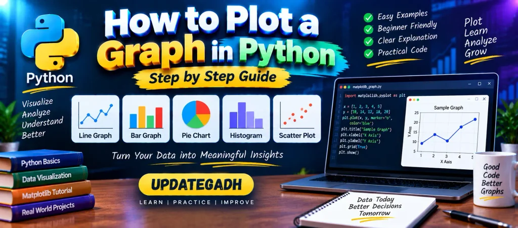
Graphs make it easier to understand numerical information by turning raw data into visual representations. Python has several tools for data visualization, and Matplotlib is one of the most widely used libraries for creating charts and plots.
With Matplotlib, you can represent data using lines, bars, pie charts, histograms, scatter points, and many other graphical formats. It is useful in data analysis, scientific computing, machine learning, and other Python projects where visualizing information is important.
YT:- DecodeIT
What is Matplotlib?
Matplotlib is an open-source Python library primarily used for creating static and interactive visualizations. It provides a large collection of functions for plotting data and customizing the appearance of charts.
The library was started by John D. Hunter and has grown into an important part of the Python data-visualization ecosystem.
How to Install Matplotlib
Before creating a graph, install Matplotlib in the Python environment where your program will run. Open Command Prompt, PowerShell, or a terminal and execute:
pip install matplotlibAfter installation, you can import the plotting module with:
import matplotlib.pyplot as pltThe pyplot interface provides convenient functions for creating and displaying charts.
Understanding the Main Parts of a Matplotlib Plot
A Matplotlib visualization is made up of several elements. Understanding these terms makes it easier to work with more advanced plots.
- Figure: The main container that holds the complete visualization.
- Axes: The region where a particular graph is drawn. A figure can contain more than one axes.
- Axis: The horizontal or vertical scale used to represent values.
- Artist: A visual element displayed by Matplotlib, such as text, lines, markers, and shapes.
What is pyplot in Matplotlib?
matplotlib.pyplot is a collection of plotting functions that makes it easy to create graphs with only a few lines of code.
It can be used to:
- Create plots and figures
- Set graph titles
- Add labels to axes
- Display data points
- Customize charts
- Show the completed visualization
Simple Graph Example in Python
Let’s begin with a basic line plot. In this example, two lists provide the x-axis and y-axis values.
import matplotlib.pyplot as plt

x = [1, 2, 3, 4]
y = [5, 8, 6, 10]

plt.plot(x, y)
plt.show()
The plot() function creates the graph, while show() displays it on the screen.
Different Types of Graphs in Python
The type of graph you choose should depend on what you want to understand from the data. The following examples demonstrate some commonly used Matplotlib charts.
1. Line Graph
A line graph connects data points with lines. It is useful for observing changes or trends across ordered values, such as measurements collected over time.
import matplotlib.pyplot as plt

months = [1, 2, 3, 4, 5]
sales = [20, 28, 25, 35, 42]

plt.plot(months, sales)

plt.title("Monthly Sales")
plt.xlabel("Month")
plt.ylabel("Sales")

plt.show()
Here, the x-axis represents the month number and the y-axis represents sales values.
2. Bar Graph
A bar graph is useful when comparing values across separate categories. For example, it can be used to compare marks obtained by different students.
import matplotlib.pyplot as plt

students = ["Arun", "James", "Ricky", "Patrick"]
marks = [51, 87, 45, 67]

plt.bar(students, marks)

plt.title("Student Results")
plt.xlabel("Students")
plt.ylabel("Marks")

plt.show()
Each student is represented by a separate bar, and the height of the bar indicates the corresponding marks.
3. Pie Chart
A pie chart divides a circle into sections to represent the contribution of different categories to a total. It is useful when the goal is to view proportions or percentage-based distributions.
import matplotlib.pyplot as plt

players = ["Smith", "Finch", "Warner", "Lumberchane"]
runs = [42, 32, 18, 24]

plt.pie(
    runs,
    labels=players,
    autopct="%1.1f%%",
    startangle=90
)

plt.title("Runs Distribution")
plt.show()
The autopct parameter displays the percentage represented by each section.
4. Histogram
A histogram groups numerical values into intervals called bins. It is useful for examining how frequently values occur within different ranges.
import matplotlib.pyplot as plt

scores = [
    97, 54, 45, 10, 20, 10, 30, 97,
    50, 71, 40, 49, 40, 74, 95, 80,
    65, 82, 70, 65, 55, 70, 75, 60
]

plt.hist(scores, bins=10)

plt.title("Score Distribution")
plt.xlabel("Score")
plt.ylabel("Frequency")

plt.show()
The bars show how many values fall into each numerical range.
5. Scatter Plot
A scatter plot represents individual observations as points. It is commonly used when you want to investigate the relationship between two numerical variables.
import matplotlib.pyplot as plt

x1 = [4, 8, 12]
y1 = [19, 11, 7]

x2 = [7, 10, 12]
y2 = [8, 18, 24]

plt.scatter(x1, y1, label="Group 1")
plt.scatter(x2, y2, label="Group 2")

plt.title("Scatter Plot")
plt.xlabel("X Values")
plt.ylabel("Y Values")
plt.legend()

plt.show()
Using two sets of points makes it possible to visually compare different groups within the same chart.
Which Graph Should You Use?
| Graph Type | Common Purpose |
|---|---|
| Line Graph | Showing trends and changes between ordered values. |
| Bar Graph | Comparing separate categories. |
| Pie Chart | Displaying parts or percentages of a whole. |
| Histogram | Understanding the distribution of numerical data. |
| Scatter Plot | Examining the relationship between two numerical variables. |
Why Use Matplotlib for Data Visualization?
Matplotlib gives Python developers considerable control over how data is presented. You can modify titles, labels, axes, markers, figure sizes, legends, and many other visual properties.
It can also be combined with other Python libraries such as Pandas and NumPy, making it useful for complete data-analysis workflows.
Complete Advance AI Topics: Click Here
SQL Tutorial: Click Here
Conclusion
Creating graphs in Python becomes straightforward once you understand the basic Matplotlib functions. The pyplot module provides a simple interface for turning numerical data into useful visualizations.
Line graphs can help identify trends, bar charts are useful for category comparisons, pie charts show proportions, histograms describe data distributions, and scatter plots help explore relationships between variables. Learning these basic chart types provides a strong foundation for more advanced Python data visualization.
Frequently Asked Questions
How do I plot a graph in Python?
You can use Matplotlib to create graphs in Python. Install the library with pip install matplotlib, import matplotlib.pyplot, provide your data, and call an appropriate plotting function.
How do I plot a graph using Matplotlib?
A basic line graph can be created using:
import matplotlib.pyplot as plt

plt.plot([1, 2, 3], [4, 6, 5])
plt.show()
Can Python create a bar graph?
Yes. Matplotlib provides the plt.bar() function for creating bar charts.
Which Python library is commonly used for plotting graphs?
Matplotlib is one of the most commonly used Python libraries for creating graphs and data visualizations.
Can I create a graph from CSV data in Python?
Yes. CSV data can be loaded using libraries such as Pandas and then passed to Matplotlib for visualization.
What is a scatter plot used for?
A scatter plot displays individual data points and can help visualize the relationship between two numerical variables.
Keywords
how to plot a graph in Python, how to plot graph in Python using Matplotlib, Python graph plotting, Matplotlib graph, Python data visualization, how to create graphs in Python, Python line graph, Python bar graph, Python pie chart, Python histogram, Python scatter plot, plot graph from CSV in Python, Python graph visualization, Matplotlib tutorial, Python plotting tutorial, create graph using Matplotlib, Python charts, data visualization in Python how How to Plot a Graph in Python Using Matplotlib to plot a graph in Python using Matplotlib Python graph plotting Python graph visualization Matplotlib tutorial Python data visualization how to create a graph in Python plot graph How to Plot a Graph in Python Using Matplotlib in Python Python plotting library How to Plot a Graph in Python Using Matplotlib create graph using Matplotlib Python line graph Python bar graph Python pie chart Python histogram Python scatter plot Matplotlib graph Matplotlib plotting in Python Python charts data visualization in Python plot graph from CSV in Python how to plot graph from CSV file in Python Python graph from CSV Python graph examples Matplotlib graph examples Python plotting tutorial how to visualize data in Python Python visualization tutorial create charts in Python Python graph code Matplotlib pyplot How to Plot a Graph in Python Using Matplotlib