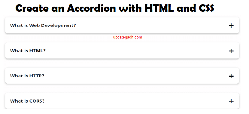
How to Create an Accordion in 3 Simple Steps for Stunning Code
Accordions are useful when you need to hide and display a large amount of information on a webpage. They allow users to switch between sections without taking up too much space.
Complete Advance AI Topics: Click Here
SQL Tutorial: Click Here
How To Create an Accordion
In this tutorial, you will learn the following:
- How to structure HTML elements to create an accordion.
- How to use CSS styles to customize the appearance of an accordion.
- How to use CSS transitions and animations to create smooth accordion effects.
- How to enhance an accordion with features such as icons and hover effects.
By the end of this tutorial, you will have a functional accordion that you can customize and use in your own web projects.
Table of Contents
- How To Create an Accordion
- In this tutorial, you will learn the following
- Project Folder Structure (How To Create an Accordion)
- HTML
- CSS
- Conclusion
- How To Create an Accordion
- Step 1) Add HTML
- Step 2) Add CSS
- Step 3) Add JavaScript
- How To Create an Accordion DEMO
- Source Code [How To Create an Accordion]
- Related Pages
- Related Articles
Project Folder Structure (How To Create an Accordion)
To create an accordion and follow along with this tutorial, make sure your project contains the following files:
- index.html: This file contains the HTML markup.
- styles.css: This file contains the CSS styles.
You can also use different file names or organize the files according to your preferred workflow.
HTML
1. Accordion Container
The accordion container is placed inside a <div> element with the class name accordion. This container holds all the accordion items.
Accordion Items
Each accordion item is represented by a <div> element with the class name accordion-item.
Inside every accordion item, there are:
- An
<input>element withtype="checkbox"and a unique ID. The checkbox controls the visibility of the content section. - A
<label>element with the class nameaccordion-header. Itsforattribute refers to the corresponding checkbox ID and acts as the accordion header. - Two spans inside the label. The first span contains the accordion item text, such as Accordion Item 1.
- The second span contains an
<i>element using the Font Awesome classesfa-solid fa-caret-rightto display an arrow icon.
Accordion Content
After the label, each accordion item contains a <div> element with the class name accordion-content. This section contains the content that expands and collapses.
The content can contain different HTML elements, including paragraphs, images, and lists. In this tutorial, a simple paragraph is used for demonstration.
CSS
1. Global Styles
- The
*selector applies common styles to all elements, includingbox-sizing: border-boxand the Poppins font family. - The body uses
#0083e9as its background color, which sets the overall page background.
Accordion Styles
The accordion class controls the width, position, and centering of the accordion container by using absolute positioning and translation techniques.
Accordion Item Styles
The accordion-item class controls the padding, background color, and border radius of each accordion item. The margin-bottom property creates space between individual items.
Accordion Header Styles
The accordion-header class styles the label that works as the header for each accordion item.
- The font size, color, and padding are adjusted to customize the header.
- The
cursor: pointerproperty changes the cursor when the user moves over the header. - The arrow icon inside the label uses the
.arrowclass and therotateproperty to create an animation when an accordion item is expanded.
Accordion Content Styles
- The
accordion-contentclass defines the color, font size, and line height of the content. max-height: 0andoverflow: hiddenkeep the content hidden initially.- The
transitionproperty creates a smooth animation when the content expands or collapses. Themax-heightproperty is animated over one second.
Conclusion
- Accordions are an effective way to present and organize content on a webpage.
- HTML and CSS can be used to create interactive and visually appealing accordions that improve the user experience.
- This tutorial covered the basic process of creating an accordion using HTML and CSS.
- By following the video tutorial and understanding the concepts explained here, you can create your own accordions and customize them according to your project requirements.
- You can experiment with different styles, animations, and functionality to create unique and engaging accordions for your websites.
- Regular practice and application of these concepts can help strengthen your understanding.
- Now you can start creating accordions for your web projects.
How To Create an Accordion
Step 1) Add HTML
<!DOCTYPE html>
<html>
<head>
<meta name="viewport" content="width=device-width, initial-scale=1">

</head>
<body>

<h2>Accordion with symbols</h2>
<p>In this example we have added a "plus" sign to each button. When the user clicks on the button, the "plus" sign is replaced with a "minus" sign.</p>
<button class="accordion">Section 1</button>
<div class="panel">
  <p>Lorem ipsum dolor sit amet, consectetur adipisicing elit, sed do eiusmod tempor incididunt ut labore et dolore magna aliqua. Ut enim ad minim veniam, quis nostrud exercitation ullamco laboris nisi ut aliquip ex ea commodo consequat.</p>
</div>

<button class="accordion">Section 2</button>
<div class="panel">
  <p>Lorem ipsum dolor sit amet, consectetur adipisicing elit, sed do eiusmod tempor incididunt ut labore et dolore magna aliqua. Ut enim ad minim veniam, quis nostrud exercitation ullamco laboris nisi ut aliquip ex ea commodo consequat.</p>
</div>

<button class="accordion">Section 3</button>
<div class="panel">
  <p>Lorem ipsum dolor sit amet, consectetur adipisicing elit, sed do eiusmod tempor incididunt ut labore et dolore magna aliqua. Ut enim ad minim veniam, quis nostrud exercitation ullamco laboris nisi ut aliquip ex ea commodo consequat.</p>
</div>

</body>
</html>
Step 2) Add CSS
Use the following CSS to style the accordion:
<style>
.accordion {
  background-color: #eee;
  color: #444;
  cursor: pointer;
  padding: 18px;
  width: 100%;
  border: none;
  text-align: left;
  outline: none;
  font-size: 15px;
  transition: 0.4s;
}

.active, .accordion:hover {
  background-color: #ccc;
}

.accordion:after {
  content: '\002B';
  color: #777;
  font-weight: bold;
  float: right;
  margin-left: 5px;
}

.active:after {
  content: "\2212";
}

.panel {
  padding: 0 18px;
  background-color: white;
  max-height: 0;
  overflow: hidden;
  transition: max-height 0.2s ease-out;
}
</style>
Step 3) Add JavaScript
<script>
var acc = document.getElementsByClassName("accordion");
var i;

for (i = 0; i < acc.length; i++) {
  acc[i].addEventListener("click", function() {
    this.classList.toggle("active");
    var panel = this.nextElementSibling;
    if (panel.style.maxHeight) {
      panel.style.maxHeight = null;
    } else {
      panel.style.maxHeight = panel.scrollHeight + "px";
    }
  });
}
</script>
How To Create an Accordion – DEMO
Collapsible/Accordion Demo
Accordions are useful when you want to switch between hiding and showing a large amount of content.
Section 1
Section 2
Section 3
Source Code [How To Create an Accordion]
<!DOCTYPE html>
<html>
<head>
<meta name="viewport" content="width=device-width, initial-scale=1">
<style>
.accordion {
  background-color: #eee;
  color: #444;
  cursor: pointer;
  padding: 18px;
  width: 100%;
  border: none;
  text-align: left;
  outline: none;
  font-size: 15px;
  transition: 0.4s;
}

.active, .accordion:hover {
  background-color: #ccc;
}

.accordion:after {
  content: '\002B';
  color: #777;
  font-weight: bold;
  float: right;
  margin-left: 5px;
}

.active:after {
  content: "\2212";
}

.panel {
  padding: 0 18px;
  background-color: white;
  max-height: 0;
  overflow: hidden;
  transition: max-height 0.2s ease-out;
}
</style>
</head>
<body>

<h2>Accordion with symbols</h2>
<p>In this example we have added a "plus" sign to each button. When the user clicks on the button, the "plus" sign is replaced with a "minus" sign.</p>
<button class="accordion">Section 1</button>
<div class="panel">
  <p>Lorem ipsum dolor sit amet, consectetur adipisicing elit, sed do eiusmod tempor incididunt ut labore et dolore magna aliqua. Ut enim ad minim veniam, quis nostrud exercitation ullamco laboris nisi ut aliquip ex ea commodo consequat.</p>
</div>

<button class="accordion">Section 2</button>
<div class="panel">
  <p>Lorem ipsum dolor sit amet, consectetur adipisicing elit, sed do eiusmod tempor incididunt ut labore et dolore magna aliqua. Ut enim ad minim veniam, quis nostrud exercitation ullamco laboris nisi ut aliquip ex ea commodo consequat.</p>
</div>

<button class="accordion">Section 3</button>
<div class="panel">
  <p>Lorem ipsum dolor sit amet, consectetur adipisicing elit, sed do eiusmod tempor incididunt ut labore et dolore magna aliqua. Ut enim ad minim veniam, quis nostrud exercitation ullamco laboris nisi ut aliquip ex ea commodo consequat.</p>
</div>

<script>
var acc = document.getElementsByClassName("accordion");
var i;

for (i = 0; i < acc.length; i++) {
  acc[i].addEventListener("click", function() {
    this.classList.toggle("active");
    var panel = this.nextElementSibling;
    if (panel.style.maxHeight) {
      panel.style.maxHeight = null;
    } else {
      panel.style.maxHeight = panel.scrollHeight + "px";
    }
  });
}
</script>

</body>
</html>
YouTube Playlist For Projects: https://www.youtube.com/@Decodeit./playlists